
Role
UI/UX
Client
Confidential
Timeline
2025
Arquiplan Logo Design
Scroll Down
01 / Concept
Strategy & Execution
PHASE 1: Building the Icon (The Symbol)
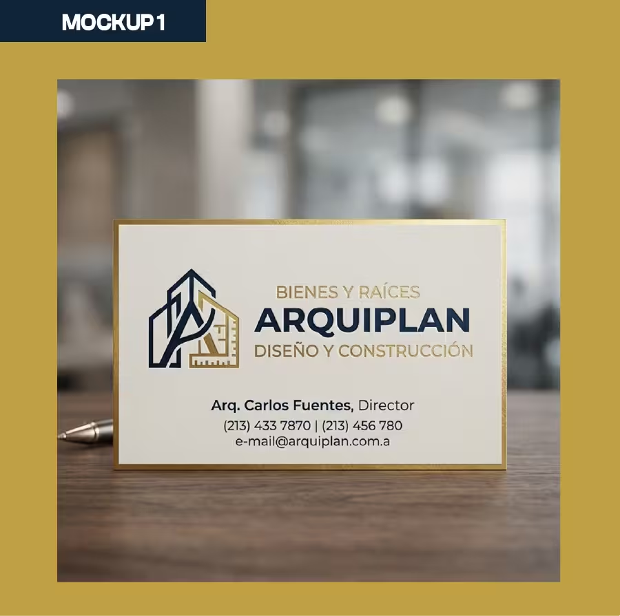
The Arquiplan icon stands out because of its clean, architectural style. It blends buildings, a measuring square, and shapes that hint at the letter “A”.
- Document Setup and Grid: * You start with a blank canvas in Illustrator (usually RGB for screens, but maybe with a CMYK preview if you know it’ll be printed).
- To get those lines and angles perfectly crisp, you turn on the Grid and check Snap to Grid. You could also set up an isometric grid using the Line tool rotated at 30° and 150° if you need a specific perspective.
- Drawing the Base Shapes: * Grab the Pen Tool or the Line Segment Tool to map out the main outlines of the buildings on the left (the dark blue part).
- Then, you draw the golden structure on the right—it creates a pitched roof shape and drops down into a measuring square. You add the little ruler marks using short, evenly spaced strokes, making sure everything lines up perfectly with the Align panel.
- Joining and Cleaning Paths: * Where lines cross or overlap (like where the golden roof cuts across the blue building), you select all the paths, go to
Object > Expand, and use either the Shape Builder Tool or the Pathfinder panel to trim the extra bits and create clean, closed shapes. - Adding Color: * Next, you set up your global colors in the Swatches panel.
- Navy Blue: Gives off a vibe of trust, professionalism, and stability (perfect for real estate and construction).
- Mustard/Gold: Brings in a feeling of quality, exclusivity, and success, really making the ruler and the “Arquiplan” text pop.
PHASE 2: Setting the Typography
Picking the right font is huge for balancing the visual weight of the symbol.
- Main Brand Name (ARQUIPLAN): * You go with a geometric Sans-Serif font, all caps, in a Bold or Black weight.
- You tweak the Tracking (letter spacing) to give the word some breathing room and elegance. Then, you convert the text to outlines (
Type > Create Outlines) so the design doesn’t get messed up if the client sends it to a print shop that doesn’t have the font.
- You tweak the Tracking (letter spacing) to give the word some breathing room and elegance. Then, you convert the text to outlines (
- Brand Descriptors: * For “BIENES Y RAÍCES” and “DISEÑO Y CONSTRUCCIÓN”, you use a secondary Sans-Serif font, but much lighter (Regular or Light). You space the tracking out even more so it matches the width of the main word. This creates a really solid, balanced block of text.
PHASE 3: Laying out the Brandbook in Illustrator
Once the logo is locked in, you set up a bunch of Artboards (either in the same file or a new one) to design the brand guidelines. You’ll want to cover things like:
- 1. Concept/Vibe: A quick page explaining what the logo means (the buildings, the ruler, the sturdy geometric feel).
- 2. Grid and Construction: Showing the logo on a technical grid to highlight the math and line weights behind it.
- 3. Clear Space: Setting up a safe zone around the logo (usually using a piece of the logo itself, like the “A” in Arquiplan or a notch from the ruler) where no other graphics or text can intrude.
- 4. Minimum Size: Shrinking the logo down to the smallest size where the tagline (“Diseño y Construcción”) is still readable, noting the size for both screens (pixels) and print (millimeters).
- 5. Color Palette: Pulling out the color swatches and listing the exact codes for different uses: CMYK (for printing), RGB (for screens), and HEX (for web dev).
- 6. Typography: Naming the font families you used (Primary and Secondary) and showing the full alphabet (A-Z) and numbers (0-9).
- 7. Logo Variations: Showing how the logo looks in different setups: full color on a dark background (like the one you shared), on a light background, grayscale, pure black and white, and how to use just the icon by itself.
- 8. What Not to Do: Showing a few examples of how not to use the logo (like stretching it, using weird colors, rotating it, or adding ugly drop shadows).
PHASE 4: Exporting the Final Files
Finally, using the Asset Export panel makes saving out the final files for the client super easy:
- Vectors:
.AI,.EPS,.SVG(these are a must for web and keeping things scalable). - Rasters:
.PNG(with a transparent background) and.JPGin a few different sizes. - The Manual: Exporting the brand guidelines as a nice, high-res
.PDF.
02 / Visuals



Next Project →Keep Exploring →Next Project →Keep Exploring →Next Project →Keep Exploring →Next Project →