
Role
UI/UX
Client
Confidential
Timeline
2025
Liga Baloncesto Logo & Brand Design
Scroll Down
01 / Concept
Strategy & Execution
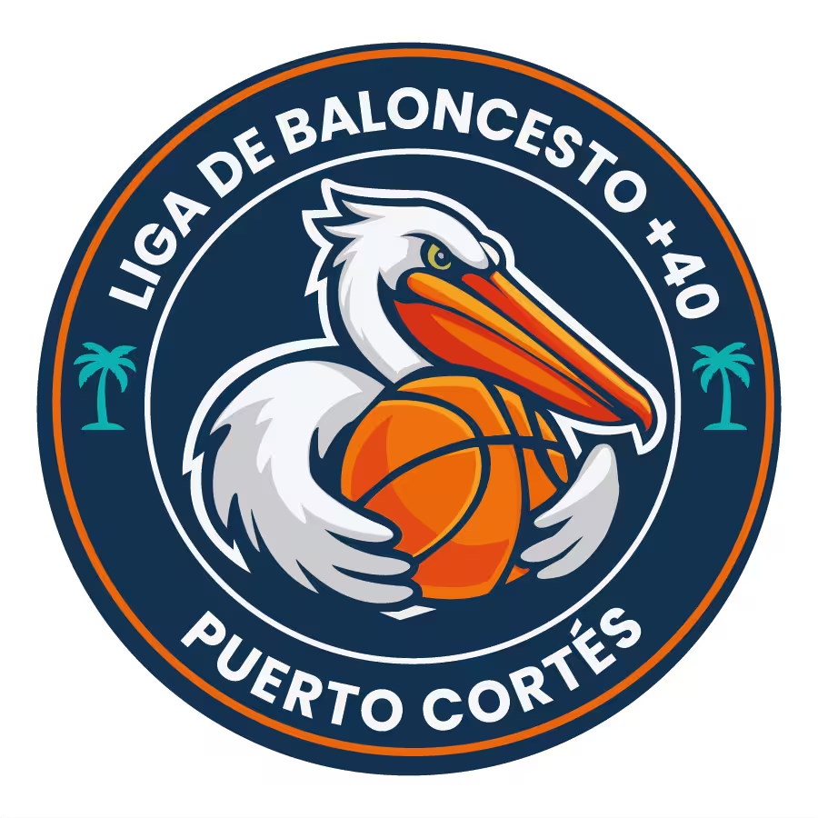
PHASE 1: Illustrating the Mascot (The Pelican and Basketball)
This is the most time-consuming part. Mascot logos usually start as a rough pencil sketch or a digital drawing on an iPad before ever touching Illustrator.
- Vectorizing the Base Shapes:
- Once your sketch is placed in Illustrator (
File > Placeand lock the layer), you grab the Pen Tool (P). Instead of strokes, you are drawing solid overlapping shapes. - You start from the back and work forward: drawing the base silhouette of the pelican, then adding the large white blocks for the feathers, then the orange beak.
- Once your sketch is placed in Illustrator (
- Shading and Highlights (The “Sports” Vibe):
- To give the pelican that 3D, muscular look, you use the Pen Tool to draw the cool gray shadows under the feathers and the darker orange/red shadows under the beak.
- The Shape Builder Tool (Shift + M) is your best friend here to trim the shadows perfectly to the edges of the white feathers.
- The Basketball:
- You start with an orange circle. For the black seams, you draw the curved overlapping strokes using the Pen Tool, expand them (
Object > Expand), and group them. - To keep the lines inside the ball, you use a Clipping Mask (
Ctrl/Cmd + 7) or the Shape Builder to punch them out. Then, add a crescent-shaped orange highlight on top to give it volume.
- You start with an orange circle. For the black seams, you draw the curved overlapping strokes using the Pen Tool, expand them (
- The Containment Outline (Crucial Step):
- Mascot logos need to stand out against any color jersey. You group the entire pelican and basketball, duplicate it, merge it all into one solid shape using the Pathfinder (Unite), and then use
Object > Path > Offset Pathto create that thick, solid white border wrapping around the whole character.
- Mascot logos need to stand out against any color jersey. You group the entire pelican and basketball, duplicate it, merge it all into one solid shape using the Pathfinder (Unite), and then use
PHASE 2: The Badge Structure and Typography
Once the mascot is solid, you build the framing around it.
- The Concentric Circles:
- Using the Ellipse Tool (L), you draw the main navy blue background circle from the center outward (holding
Alt/Option + Shift). - You duplicate and scale the circle to create the thin inner white ring and the thick outer orange ring.
- Using the Ellipse Tool (L), you draw the main navy blue background circle from the center outward (holding
- Type on a Path:
- You draw an invisible circle right in the middle of the navy band.
- Grab the Type on a Path Tool to type “LIGA DE BALONCESTO +40” across the top. You use a heavy, blocky Sans-Serif font to give it that athletic impact.
- For “PUERTO CORTÉS” at the bottom, you duplicate the text circle, type the new words, and use the handle to flip the text to the inside of the curve. You’ll need to adjust the Baseline Shift in the Character panel so it aligns perfectly with the top text.
- The Accents:
- Drop in the teal palm tree vectors on the left and right to separate the top and bottom text and balance the negative space.
PHASE 3: Laying out the Brandbook
For a sports league, the brand manual is all about merchandising and uniforms. Printers need very specific rules so the logo doesn’t get ruined on a t-shirt or a gym floor decal.
- 1. Concept & Vibe: Explaining the coastal identity (pelican/palm trees) combined with the competitive spirit of a veteran (+40) basketball league.
- 2. Grid and Containment: Showing how the mascot breaks out of the inner circle but is contained by the outer badge, creating a nice 3D pop.
- 3. Clear Space: Using one of the palm trees or the basketball as the measurement for the padding around the logo.
- 4. Color Palette: This is heavy on contrast. You need to document the Navy Blue, Bright Orange, Crisp White, Cool Gray (for shading), and the Teal accent. Providing Pantone (PMS) codes here is non-negotiable, as uniform manufacturers rely on them for fabric dyes and screen printing.
- 5. Typography: Detailing the bold, athletic Sans-Serif font used in the badge.
- 6. Essential Logo Variations: This is the most critical page for a sports logo:
- The Full Badge: (What we see here).
- The Mascot Only: The pelican and ball completely isolated from the circle (great for chest logos on practice jerseys).
- Flat/Fewer Colors: A version where the gray shadows and teal accents are removed to reduce the number of ink colors (saves money on screen printing).
- Monochrome/1-Color: A pure black and white version. This requires re-working the overlapping lines heavily so the pelican is still readable without color.
PHASE 4: Exporting the Final Files
The Asset Export panel gets a heavy workout here.
- Vectors:
.AI,.EPS,.SVG. You absolutely must include the separated flat and 1-color vector versions for apparel manufacturers. - Rasters: High-resolution
.PNGfiles with transparent backgrounds. Since it’s a badge, you’ll want to provide a version with a slight white stroke around the very outside edge just in case they drop the PNG onto a dark website background. - The Manual: The final
.PDFbrand book.
02 / Visuals




Next Project →Keep Exploring →Next Project →Keep Exploring →Next Project →Keep Exploring →Next Project →