Fixing Landing Page Conversion Mistakes That Cost You Leads
Identify common landing page conversion mistakes that drive away prospects and learn how to optimize your UX to turn more visitors into qualified leads.

I often see business owners spend thousands of dollars on Google Ads or LinkedIn campaigns only to wonder why their lead count remains stagnant. In my experience, the problem rarely lies within the ad targeting itself; instead, it is usually found on the destination page. Many landing pages suffer from subtle UX friction points that frustrate users and cause them to bounce before they ever share their contact information.
When you pay $5.00 or $10.00 per click, every bounce is a direct hit to your marketing budget. In 2026, user expectations for speed and clarity are higher than ever. If a visitor cannot understand what you offer and how to get it within five seconds, they will leave. To help you stop the bleed, I have identified the most common landing-page-conversion-mistakes and provided actionable ways to fix them.
1. The Disconnect of Message Mismatch
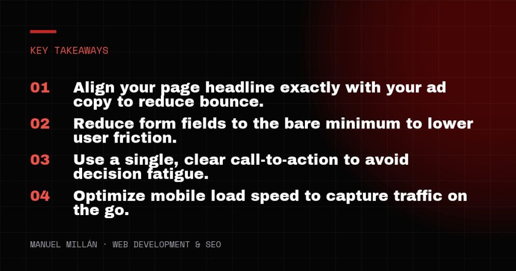
One of the fastest ways to lose a prospect is to promise one thing in an ad and deliver something else on the landing page. This is known as poor message match. If your ad mentions a specific “20% Discount on SEO Audits,” but the landing page is a general “About Us” page or a broad service overview, the visitor feels misled. They have to hunt for the offer they were promised, and most people simply won’t do that.
In my work with US-based service providers, I find that tightening the message match can often double conversion rates overnight. Your landing page headline should use the same or very similar keywords as your ad copy. This creates a “scent of information” that reassures the user they are in the right place. If you are running multiple ad groups targeting different pain points, you should ideally have dedicated landing pages (or dynamic content) for each one to maintain this continuity.
2. High Friction Lead Capture Forms
I have seen many marketing managers insist on asking for 10 different pieces of information on an initial contact form. While it is tempting to want to know the prospect’s annual revenue, company size, and specific budget before you even talk to them, every additional field you add decreases the likelihood of the form being completed. This is a classic example of landing-page-conversion-mistakes where the desire for data overrides the need for leads.
For most small and mid-sized businesses, the goal of a landing page is to start a conversation, not to complete a full customer profile. Aim for the “Minimum Viable Data” required to follow up. Usually, this is just a name, email address, and perhaps a single qualifying question. If you absolutely must collect more data, consider using a multi-step form. Breaking a long form into two or three smaller steps feels less overwhelming to the user and can significantly increase completion rates. In 2026, users value their time and privacy; respect both by keeping your forms lean.

3. Overwhelming Choice and Decision Fatigue
A common mistake is treating a landing page like a mini-website. I often see pages that include the full site navigation, links to social media profiles, and multiple offers all on one screen. This creates the “Paradox of Choice.” When a visitor is presented with too many options—read a blog post, follow us on X, sign up for a newsletter, and book a consultation—they often choose to do nothing at all.
A true landing page should have one goal and one primary Call to Action (CTA). I recommend removing the standard header navigation entirely. By eliminating the exits, you keep the user focused on the value proposition at hand. Ensure your primary CTA button stands out visually. Use a high-contrast color that isn’t used elsewhere on the page, and make sure the button text is action-oriented, such as “Get My Free Quote” rather than a generic “Submit.”
4. Neglecting the Mobile User Experience
It is easy to design a beautiful landing page on a 27-inch 4K monitor and forget that 60% or more of your traffic may be coming from a smartphone. Mobile users have different needs and physical constraints. If your CTA button is too small to tap with a thumb, or if your headline takes up the entire screen, you are losing leads. Landing-page-conversion-mistakes on mobile are particularly costly because mobile users are often looking for immediate solutions.
Test your page on actual devices, not just browser simulators. Check the “thumb zone”—the area of the screen most easily reached when holding a phone with one hand. Your CTA should be easily accessible within this zone. Furthermore, pay close attention to load times. A page that takes five seconds to load on a 5G connection will feel like an eternity to a mobile user. In 2026, Google’s Core Web Vitals are not just for SEO; they are a direct indicator of how likely a user is to stay on your page and convert.

5. Weak Social Proof and Credibility Gaps
US consumers are naturally skeptical of online claims. If your landing page makes bold promises but offers no proof, visitors will hesitate. I often see businesses use generic stock photos and vague testimonials like “Great service!” from “John D.” This does little to build trust. In fact, poor-quality social proof can sometimes be worse than none at all because it looks fabricated.
To fix this, use specific, verifiable social proof. If you have worked with well-known brands, display their logos prominently. If you have testimonials, include the person’s full name, title, and a photo if possible. Even better, use short video testimonials or link to third-party review platforms like Google Business Profile or Clutch. When showing results, use concrete numbers. Instead of saying “We helped a client grow,” say “We helped a New York-based law firm increase their lead volume by 40% in three months.” These specifics provide the credibility needed to push a hesitant prospect toward a conversion.
Conclusion
Fixing these common errors is not about a total redesign; it is about removing the barriers between your visitor and your offer. By aligning your messaging, simplifying your forms, focusing on a single goal, and ensuring a seamless mobile experience, you turn your landing page into a high-performance asset. Start by auditing your highest-traffic pages today and look for one piece of friction you can remove.
Need a reliable web partner?
I design and build fast, SEO-ready websites for businesses and agencies, including white-label projects. Tell me about yours.
Let's talk